I admit that the USBP series looks kinda… bland. It’s text and line drawings; not a whole lot can be done to jazz that up. Especially since I have no head for graphics design whatsoever apart from layout diagrams.
Still, one reader sent me a mockup of a revised cover of USBP #18:
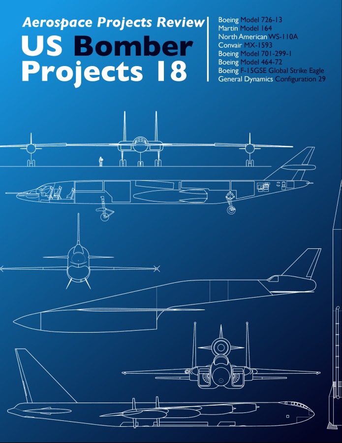
Things are moved around a little bit, but the obvious change is the addition of color. The suggestion was also made to consider color-coding each title in the USXP series. Just off the top of my head, I came up with:
Bombers: Olive Drab
Spacecraft: Black
Launch Vehicles: Blue on bottom, transitioning to black at the top
Fighters: slightly bluish gray (like the F-15 or F-22)
Transports: ??
VTOL: ??
The USBP#18 cover was re-done to reflect this, thusly:
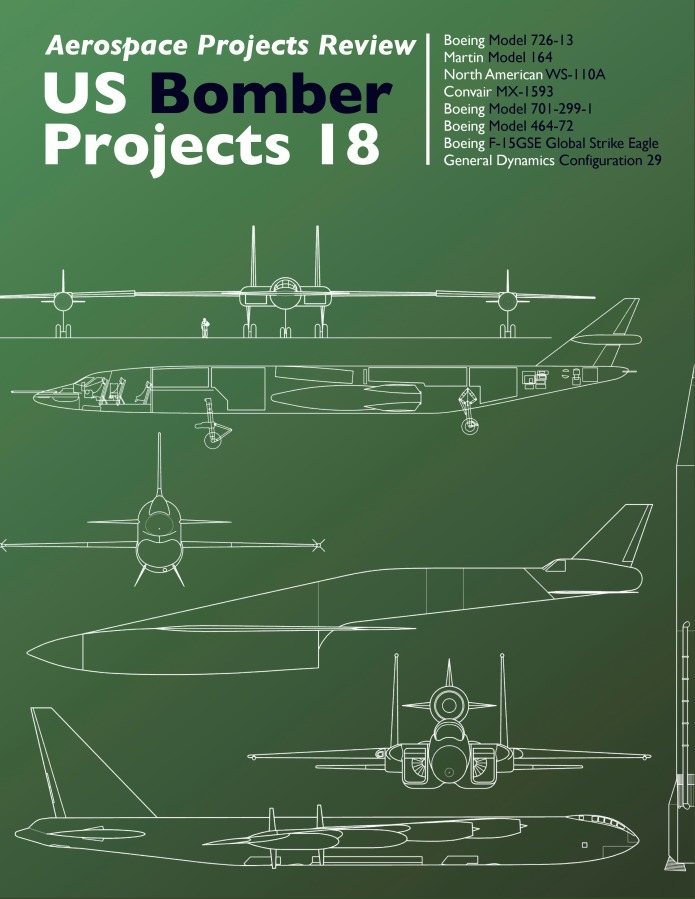
Thoughts? Is this more appealing?How about color-coding… good idea or not? And if so, what colors?
I tried something vaguely like this once before, with USBP#05.
It looks good. But then I am biased 🙂
Those look great. Almost makes me want to buy all of them all over again just to get pretty colors on the covers. Seriously, they are attractive. As far as colors go, just make all issues of each series – Bomber, Transport, etc, the same color.